Just a heads up that Sean Bagshaw will release a new video series called Iceland Highlands next week, and I’m once again partnering with him to make it available on my website. This course starts in the stunning landscapes of volcanic Iceland and then moves on to using digital tools in Lightroom and Photoshop to bring that beauty to life. Through nine chapters, Sean connects viewers to different aspects of creatively interpreting the light in order to express the photographer’s intention while also ensuring that the light itself has a voice in the final result.
The TK9 plugin for Photoshop is used throughout the Photoshop portion of this course, though Sean also explains how to accomplish most tasks using just Photoshop. I’m sure you’ll find the chapters informative and enjoyable to watch. Please keep an eye on your email and this blog for special discounts on all products when this new course is launched.
I’ve not created an end-of-year review of favorite images before. I’m generally working on images one-at-a-time in an ongoing and continuous process. The current image becomes my new favorite, and I don’t often look back at what was processed earlier. This year was a little different for several reasons.
It was the first time in decades that I didn’t take any pictures with a “real” camera. All images were shot with my now-ancient first-gen iPhone SE. I didn’t use a tripod either. Everything was hand-held. For a guy that used to lug over 30 pounds of large-format gear to Coyote Buttes, I feel both lazy and liberated at the same time.
All the pictures were local light, many from walks around the neighborhood. I added less than 5,000 miles to my car’s odometer this year, very little of it dedicated to photography. I simply took pictures wherever I happened to be and included some photo outings in trips for other purposes. I love photography but am trying to keep a low-carbon profile in everything I do.
Artificial intelligence (AI) came onto the scene in a big way. It made me think about photography a little differently. I still want to take pictures like I always have but am more open to interpreting them in ways that don’t necessarily look photographic. Generative Fill in Photoshop was an exciting new choice, but I also explored other Photoshop plugins, like Topaz filters, to see what they might offer in terms of interpreting light in new ways.
So, this was a year of changes both in how I take pictures and how they were processed. I still used the TK9 plugin and luminosity masks extensively in processing, but there was more experimentation at all stages of the workflow. I thought it would be interesting to compile some of my favorite images into a blog to look at the themes and the progression that came from trying new things.
It was a good year for wildflowers in Arizona, and Picacho Peak State Park, which often has a good display, is a short drive from my home. Unfortunately, everyone else wanted to see the flowers, just like me, and it was an hour’s wait just to get into the park. Sorry, that wasn’t going to be fun, so I parked outside the gate and just walked along a service road knowing I would be content with whatever I found compared to dealing with overcrowded trails and parking lots. This is an image taken on this hike. A Topaz filter was used to simplify the image’s details.
Barrio Viejo is a historic part of Tucson. It has several photography galleries and is currently undergoing quite a bit of renovation/gentrification. I visit frequently to see what’s new in the galleries. While there, I usually stroll around to look at what’s changed and how the restorations bring new color and texture to these old facades. This image was processed with the Color Sketch action in the TK9 plugin to help enhance edge detail.
Stairwells were definitely a theme this year. The little iPhone camera seems to like them. The fixed 29-mm equivalent focal length lens works well with architectural subjects in general, and the f/2.2 aperture provides better depth-of-field than newer smartphone cameras.
This is the same stairwell. Just looking up instead of looking down.
And still more stairs. This time the entrance to a parking garage. Like with all images, processing in Photoshop was a vital step in creating the final image, but places like this remind me that the raw material for photography (light) is endless and everywhere.
Cactus flowers are plentiful in Tucson, though this one is from a non-native species known as the Argentine Giant. This specimen is on the roadside where I walk several mornings each week, and I kept tabs on it knowing I wanted to be there when it finally decided to bloom. This is a 3.7-megapixel crop from a 12-megapixel capture, but it’s still a single exposure. Backing up a little and cropping provides excellent depth-of-field so focus-stacking is unnecessary.
Another plant along my walking route was this large agave that succumbed to the hot, dry summer. Patterns and textures have long been a favorite theme. They seem to show up quite randomly wherever I go but are always welcome. The black and white sketch action in TK9 helped add lines and texture to enhance the pattern of the leaves.
Another cactus flower, this time from my driveway. This is a barrel cactus, and its flowers bloom after the summer monsoon rains start. This was a very chaotic composition, but Topaz Studio 2 offers a large variety of “looks” to help simplify the details and bring the flower into strong visual focus, which was the intent when the image was taken. Previously, I might not have bothered to photograph or process such a disorganized subject, but by broadening the processing alternatives increases the likelihood of producing a final image that is true to the original visualization.
Another driveway cactus picture. These are the fruits of the Santa Rita cactus. It was another scene loaded with chaotic details, but the arrangement of fruits and their contrasting color compared to the blue-green cactus pads definitely offered potential. This time Photoshop’s new Generative Fill was tapped to provide the simplification. I used the TK Gen Fill plugin and the description “drawing, cactus pads with cactus fruits” as the prompt. I also set the generative fill opacity to just 35%. This kept much of the reference image’s composition intact, but allowed the AI to remove most of the distracting details.
This is a storm over the Catalina Mountains on the north side of Tucson. I was watching from a safe distance as lightning struck the mountains followed by rolling thunder. Rain poured from the clouds, and sunset lit the western sky. Unfortunately (but not surprisingly), I wasn’t fast fast enough to capture the lightning in any of my exposures. However, AI once again came to my rescue. It took several iterations, but I finally was able to add a bolt that captured both the beauty and the drama of the event.
One of the best discoveries about using the iPhone for photography is how easy it is to to take architecture pictures with it. Pointing a regular camera upward to take a picture requires either takes a very tall tripod or strong arms and a neck brace. The smartphone camera is so small and light that it actually invites exploring light from different angles, and looking up with the camera is no problem at all. I also like how architecture images lend themselves to a wide variety of interpretation. There is a sense of reality in the buildings that is retained even when other elements in the scene are obviously processed to look unreal.
Same building, same day, same time, same light, same camera. Different composition, different processing.
The nearby University of Arizona campus is a favorite location to search for interesting light. I prefer to go when classes are on break as it provides a sense of solitude similar to what one can find on many nature trails. This is an image where the black and white sketch action in TK9 helped define the edges better to provide a crisper looking image.
Another thing that amazes me about iPhone images is the amount of detail that comes through in a print from such a tiny camera. Individual leaves, light poles in the distance, and more texture than you could see with the naked are are all clearly visible in the 12 x 16 print of this image. Is it as good as a 61-megapixel image from a Sony A7R-IV? Probably not, but at 12 x 16, the images are at least as sharp and detailed as those from my 24-megapixel APS-C camera. The iPhone is also a lot easier to carry up five flights of stairs to take this picture, and the 12-megapixel images are a breeze to develop even for complex adjustments. Photography is a lot more fun . . . when it’s actually fun.
It’s amazing how the rest of the world disappears when I’m making pictures. Whether it’s traipsing around the University of Arizona campus looking for unique angles or in front of the computer searching for a unique interpretation, the creative moment takes hold, and I happily check out from the real world, following the light wherever it wants to go. And just like how the computer allows me to be more spontaneous with trying new processing techniques, the iPhone is a great tool for experimentation in the field. It finds pictures in places where I might not have bothered to take my “real” camera out of the bag. Looking back through favorite photos of 2023 gets me excited for 2024. Hopefully more fun ahead.
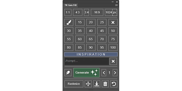
TK Gen Fill version 1.4.0 was recently released and provides several updates. This is a free Photoshop plugin. If you have an earlier version, just use your original download link to get it. The link always provides the latest version. You can also get a new download link here. The panel interacts with the generative fill functionality inside Photoshop to provide easier and unique access to some of the features.
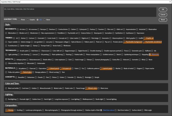
The biggest change in this version is the addition of the INSPIRATION bar on the main interface. It opens a new window for editing the prompt and adding descriptive modifiers. The modifiers are the same ones found in Adobe Firefly. Right-clicking on the modifiers toggles them on and off as favorites. An orange highlight is added when they are designated a favorite.
In addition to the obvious new INSPIRATION features, several smaller changes have also been incorporated.
Green color has been added to the “Generate” button and to the panel’s docking icons.
The “Rasterize” button now works on any smart object layer. On a gen fill smart object, it also deletes the layer mask after the layer is rasterized.
The “Delete” button (trashcan icon) also now works on any layer. If the new active layer after deleting a layer is a gen fill smart object, the variation counter on the panel shows the number “1”. If the new active layer after deleting is NOT a gen fill smart object, the variation counter is blank.
“1024” button—Clicking it now generates a duplicate, resized image that makes the LONG side 1024-px. CTRL/command+click duplicates the image and makes the SHORT side 1024-px.
Updated code hides the selection edges when they’re not necessary.
Adobe’s generative fill continues to evolve as shown by the newly available Firefly Image 2 (Beta) online. Hopefully these new features can eventually be incorporated into the TK Gen Fill plugin if Adobe adds them to Photoshop. If you have a feature you’d like to see in the plugin, please leave a comment and I’ll add it to my list.
At some point in the future, generative fill credits will supposedly be necessary for using Adobe’s generative fill at optimized speeds. Adobe originally indicated that this was going to start on November 1. However, the following notice recently appeared on the Adobe website.
It looks like the November 1 rollout of generative fill credits has been postponed. So, it’s a great time to experiment with generative fill and see what it can do for your images and your creativity. Get inspired!
This video below is Dave Kelly’s most recent overview of the TK Gen Fill version 1.4.0 update.
Like many photographers, I’ve been experimenting with Adobe’s new generative fill artificial intelligence (AI) as part of my Photoshop processing. The new TK Gen Fill plugin makes this easy. I’ve been repeatedly trying different settings and prompts and then clicking its “Generate” button. I want to understand what’s going on behind the scenes in order to better control the process.
With regard to using generative fill with photographs, I’ve noticed that it works best to approach its use with the concept of blending two photographs together as opposed to just adding new content to the image. Specifically, the two photographs that are ultimately blended are the on-screen image and the image described by the generative fill prompt.
The goal is to find a balance between the on-screen image and the image described by the generative fill prompt entered by the photographer (the prompt image) to create a result that looks good. That includes generating new content described by the prompt, but also retaining the features of the original image that will be important in the final result.
In some cases, such as completely replacing an element in the on-screen image or filling transparent pixels with something entirely new, the balance is easy. The prompt image needs to replace the on-screen image entirely (at least in the area selected). In this scenario, it’s not necessary to even provide a description for the prompt image. Simply leaving the prompt blank effectively creates a prompt of “Do your best to fill the selected area.” The AI examines the scene and the pixels surrounding the selected area and does what it can to create content that matches the prompt and blends well, and the results can be surprisingly good.
Unfortunately, that’s not always the case. Even in this somewhat simple situation, it might look like generative fill is not up to the task. Seeing a gen fill failure, it’s easy to assume that Adobe rolled out the technology too soon and that it’s not going to be all that useful. However, generative fill is only a tool, and like most tools, the skill of the user plays a role in how well the tool performs.
After playing with generative fill for several weeks, I’ve identified three factors that, when properly applied, can help improve the results when using it . . . or, at least, can help diagnose what went wrong if the results aren’t what was expected.
Create the proper selection.
Write an appropriate prompt.
Use partial selections to fine-tune the balance between the on-screen image and the prompt image.
Additionally, when evaluating the results of generative fill, the question I ask myself when I don’t get what I expect is: “What’s wrong with this blend?” I use the three factors listed above to help determine this. I also consider the first diagram and think about whether I have chosen the correct balance between the on-screen image and the image described by the prompt (prompt image). Since the generative fill AI is trying to blend what I have on-screen with what it creates, I need to provide it with the information to make this blend feasible, which, in turn, will make it look more appropriate for what I intended. I’ve included a couple of examples below.
Proper selection
In the image below, I did a copy and paste to move the sun closer to the lighthouse. The challenge is to now remove the obvious line and blend the two parts together.
I tried to use Photoshop’s Remove tool, but it cannot convincingly fix this. Generative fill would be the next option. I used the Selection Brush in the TK Gen Fill plugin at 100% opacity to make what appeared to be a perfect selection for generative fill to remove this line. (The latest version of TK Gen Fill uses a magenta overlay at different opacities to define selections.)
The results after generative fill are below.
Sadly, it’s not very good. Instead of removing the line, it merely shifted it a little to the left. The other variations were a bit better, but the blend didn’t look natural or appropriate in any of them.
Considering the three factors that can affect the process, the first (Create a proper selection) seemed the most obvious reason why this generative fill attempt failed. Remember, the AI is trying to blend my on-screen image with the prompt image. In this case, I had left the prompt field blank, meaning the prompt was essentially “Do your best to remove this line,” which was accurate for what I wanted to accomplish. So, since I had the correct prompt and degree of selection (100%), I needed to consider modifying my selection.
I did this by making the Selection Brush larger to give the AI more room to do its job of blending my on-screen image with prompt image.
And this is what I got.
Much improved! This variation looks quite natural. Once I got the selection right, generative fill was able to blend the on-screen image with the prompt image remarkably well. I knew the possibility was there, but made the mistake of not giving the AI enough room (a large enough selection) to do its job. Once I understood the problem (it’s usually one of the three factors listed above), it wasn’t too hard to formulate a solution.
Appropriate prompt and partial selections
The image below was probably never going to work as a great photograph. It’s a cropped iPhone image of the cactus at the end of my driveway. I can do a lot in Photoshop, but pulling a good image out of this would be a struggle I would likely lose in the end.
However, generative fill is great at turning photos into ‘art’ using partial selections. Partial selections are at the heart of the blending process between the on-screen image and the prompt image. A partial selection allows generative fill to blend the onscreen image with the prompt image in direct proportion to how much the image area is selected. The greater the degree of selection, the more the final result will look like the image described by the prompt. A lower degree of selection means more of the original image is retained. In other words, the prompt image is blended into the original image in proportion to how much of the original image is selected.
While Quick Mask Mode and channel masks can be used to generate partial selections, the percentage buttons on the TK Gen Fill plugin (outlined in red) are the quickest way to do this with a single click.
In this case, I wanted to make this photo look like stained glass, so “stained glass” was my prompt and I set the percentage selection at 50% to start. In other words, I wanted 50% of the image to be based on the original image (on-screen cactus image) and 50% to come from the generative fill AI based on the “stained glass” prompt (prompt image). One of the results is shown below.
This definitely looks like stained glass, and I can see my original image in there to some degree, but it’s not what I was expecting or hoping for. Of the three factors that I can use to control for generative fill, writing an appropriate prompt and/or choosing a different percentage of partial selection were the things I could potentially experiment with to improve the results
I lowered the percentage of selection to 25%. This would favor the original on-screen image more and the “stained glass” prompt image less. The best result I got with this is shown below.
Yes, it looks more like my original image, but the ‘stained glass’ effect is now gone. There is a glass-like look to this variation, but it’s not stained glass.
Since lowering the percentage of selection didn’t provide the result I was looking for, updating my prompt was the next thing to try. Keeping in mind that generative fill is to a large degree ‘generative blend,’ I changed my prompt to be more informative of the result I wanted. Specifically, I changed it to “stained glass, cactus pads with cactus fruits.” I also returned the percentage selected to 50%. The best variation using these parameters is shown below.
This result is closer to what I had in mind. It sort of looks like stained glass, but also looks like my original image in that the cactus pads and cactus fruits are clearly visible. By refining the prompt to describe not only the look I had in mind (stained glass) but also to describe the major elements in the scene (cactus pads with cactus fruits), generative fill was able to create a better blend. The original content of the scene was incorporated more accurately into the result because the prompt referenced elements in the original scene. Then, when the AI evaluated my original image, it found the cactus pads and cactus fruits present there, and kept the content in a similar location in its stained glass version since the partial selection was set at 50%.
Summary
I will be the first to admit that Photoshop’s generative fill is a fickle process. Complete control with predictable results is probably unattainable using the current state of the technology in Photoshop. But that’s not necessarily a bad thing. While gen fill can fail to meet expectations, it can also exceed them. And while getting a good result can sometimes seem luck-dependent, there are ways for the photographer to influence the odds in their favor, just like with photography itself.
The key to using generative fill successfully with existing photos, I think, is to approach it from the standpoint of how to accomplish the best blend between the onscreen image with the prompt image. And when doing this, keep the three factors discussed in mind and adjust accordingly based on results.
Create the proper selection.
Write an appropriate prompt.
Use partial selections to fine-tune the balance between the on-screen image and the prompt image.
The video below by Dave Kelly demonstrates more clearly how manipulating the degree of selection with the TK Gen Fill percentage buttons can affect the generative fill results.