NOTE: The Magic Mixer plugin is on sale for $7.50 (25% off the regular price of $10) until the end of April. Get it here.
I have received a few questions about the TK Magic Mixer plugin. I thought it might be useful to share the answer with readers. If you have additional questions, please leave comment and we can continue the conversation.
Q: Why use the Channel Mixer adjustment for conversion to black and white?
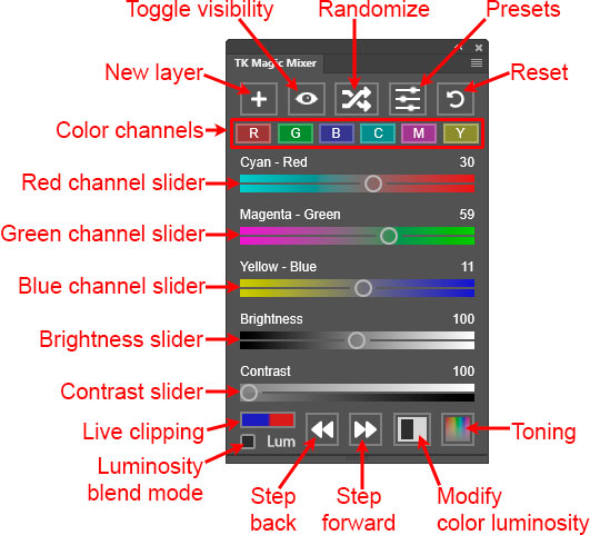
A: The Channel Mixer is underutilized because it’s difficult to use. I wanted to improve the user experience with this adjustment and see how that might influence post-processing. One of the main reasons to consider it for black and white is that it works for 8-bit, 16-bit, and 32-bit images. Not all adjustment layers are available for 32-bit images. For example, the Gradient Map and Black and White adjustment layers, which are also used for converting images to black and white, don’t work in 32-bit mode. Channel Mixer is one of those that DOES work with 32-bit images. Photographers are increasingly asking about having tools that work for 32-bit images, so this is becoming an important consideration.
Q: What are the important features that prompted you to experiment with the Channel Mixer to convert images to black and white?
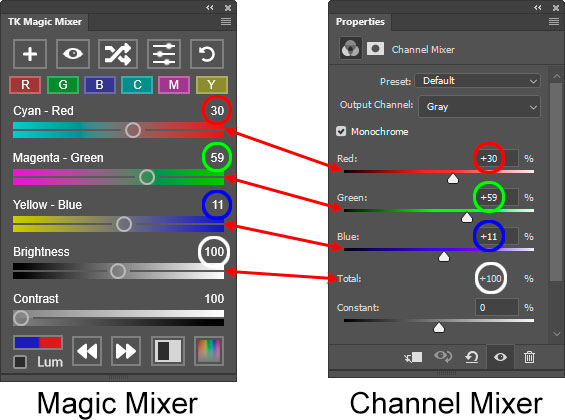
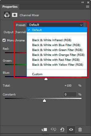
A: Channel Mixer has always been useful for conversion to black and white. If you look at the default adjustment presets in the Properties panel for Channel Mixer, you will see that they all provide a conversion to black and white.
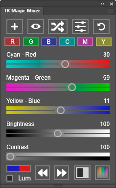
However, these presets are about the only way to utilize this adjustment. Trying to convert color images to black and white by manually by moving the Channel Mixer’s sliders isn’t easy. Moving them also affects image brightness and this makes evaluating the effect of slider changes difficult. Magic Mixer unlocks new possibilities for using the Channel Mixer to create black and white images. It does this by keeping image brightness constant as the color channel percentages are changed and by providing an independent Brightness slider.
Q: Are there advantages to using Magic Mixer over other methods in Photoshop to convert to black and white?
A: Yes. Since Magic Mixer works through the Photoshop Channel Mixer, it means that it’s also possible to affect the neutrals in the image (blacks, grays, and whites) during the conversion process. Other methods don’t do this. Whatever level of gray is present in the color image remains the same after conversion to black and white. For example, the Black and White adjustment layer has six color sliders, but no “Neutrals” slider. So, in an image that has a combination of colorful and neutral elements, only the colored elements can be made lighter and darker. The gray, black, and white elements can’t be changed. The Magic Mixer, on the other hand, has a dedicated Brightness slider that allows neutrals to be independently adjusted along with making changes to color brightness via the color sliders. So, it’s possible to adjust brightness of both colors and neutrals on the same layer. This can be useful when attempting to make a dark, moody conversion or a high-key one. However, I should make clear that, even with the Magic Mixer, the black point remains fixed when the Brightness slider is moved. Whatever is black in the color image will still be black after conversion to black and white. Gray and white values, though, can be adjusted brighter or darker quite easily, and this can add a very different mood to the final conversion.
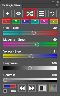
Another advantage of Magic Mixer is that it provides some unique entry points for converting color images to black and white. The six Color Channel buttons (R, G, B, C, M, and Y) offer conversion alternatives that might not have occurred to the photographer when they thought about experimenting with black and white. These channels, especially C, M, and Y, aren’t readily available when doing conversions using other Photoshop methods, and they generally create six distinct options that can be further tweaked with the plugin’s color channel sliders. The Randomize button also offers a new way to experiment with black and white. Each click of the button provides another conversion alternative. The photographer can quickly cycle through many different options without having to adjust several different sliders like with the other Photoshop adjustments. Overall, the Magic Mixer allows for discovering and fine-tuning new black and white alternatives in a highly efficient manner.
Q: I haven’t figured out the Contrast slider. How do I use it?
A: What’s happening when you move the contrast slider to the right to increase contrast is that the three color channel sliders controlling the Red, Green, and Blue channels are repositioned. The middle one does NOT move (Cyan-Red in the example below), the left-most one moves to the left (Magenta-Green in this example), and the right-most one moves farther right (Yellow-Blue in this case). The Magic Mixer looks at the relative positions of all three color channel sliders and chooses which to keep stationary and which two to move. There is always an increase “channel” contrast as a result.
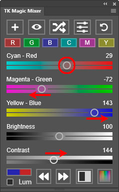
Obviously, though, the way this affects the image is variable. It depends on 1) the colors in the image and 2) the position of the color channel sliders before moving the Contrast slider. To a large degree, then, the Contrast slider is a also bit of a “random” slider, but moving it to the right can sometimes intensify the effect of the current color channel slider settings to increase tonal contrast in the image.
The real benefit of the Contrast slider, though, is that it also affects the Randomize button. As the Contrast slider is moved to the right, clicking the Randomize button generates more variation in the image since it allows a larger number of random numbers to be considered in the randomization process. So, if you want to see a bigger difference in the sequential results from clicking the Randomize button, use a higher Contrast value.
Q: What about using Magic Mixer on color images?
A: It’s possible to do this by clicking the plugin’s “Lum” checkbox. This changes the blend mode of the “Magic Mixer” layer on the Layers panel to Luminosity. The Channel Mixer is still in “Monochrome” mode, and this, combined with Luminosity blend mode, means that the Magic Mixer only affects the brightness of the image’s colors. The image is NOT converted to black and white. While this can be useful for exploring and experimenting with how color brightness affects the image, usually only small adjustments are possible to maintain a realistic look to the image. Converting the image to black and white, on the other hand, allows for more extreme adjustments, which often still look “natural.” In other words, adjustments to color luminosity usually need to be subtle, but adjustments that convert to black and white can be more radical. The Magic Mixer can do both. Dave Kelly’s latest video covers how the Magic Mixer works in Luminosity blend mode.
Q: But what about NOT checking the “Monochrome” checkbox in the Channel Mixer adjustment and directly affecting image colors by moving the Red, Green, and Blue sliders while keeping brightness constant? Can the Magic Mixer do that? Wouldn’t this be an alternative method for color grading?
A: No. Magic Mixer only works by using the Channel Mixer in “Monochrome” mode, i.e., the Channel Mixer’s “Monochrome” checkbox is checked. I’ve experimented extensively with adjusting the color channels with the “Monochrome” checkbox unchecked in attempts to logically color grade the image using the Channel Mixer, and I’m pretty sure this isn’t a good use for this adjustment. At least not in a way that can produce a desired result. I’ve seen videos on YouTube that purport to be able to color grade effectively with the Channel Mixer, but my tests show that it’s far from optimal. Things like color saturation, for example, can significantly affect the results to the point that it’s nearly impossible to predict how moving the color channel sliders will actually change a chosen color in the image, and the results often look very unrealistic. Adjusting the color channels and keeping brightness constant with “Monochrome” unchecked would be possible with a Photoshop plugin, like Magic Mixer, but the results are so unpredictable that it’s not worth the effort. There are better ways to color grade images, like using the color grading functionality in the TK9 plugin or other Photoshop adjustments, like Color Balance.
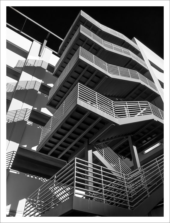
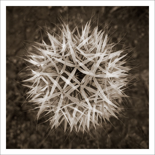
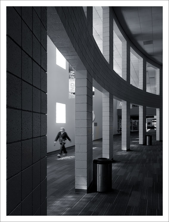
Personal note: I’m having a lot of fun with the Magic Mixer. My experiments with the color channel buttons (R, B, G, C, M, and Y) and the Randomize button (with Contrast cranked up to around 150) have been quite positive. I usually find a good conversion relatively quickly. This then becomes my starting point for fine-tuning with the Magic Mixer’s color sliders or additional processing techniques to enhance the results. I’ve included a few images below where Magic Mixer was the conversion method. I’m not sure I would have arrived at any of these without the plugin.